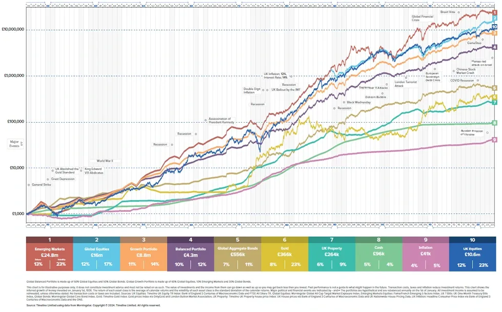
The chart displays the price increases of various assets since 1926. Many of the major asset classes out there are displayed here. This includes property, gold, “balanced” funds (60% stocks and 40% bonds) and Global Index funds among others.
You can see how they increase with time vs inflation which is the pink line at the bottom. Your investments need to outpace inflation by the most significant margin possible to give you the best real return.
For me there are 3 big takeaways from this chart that are worth remembering:
- Established major assets only ever increase in valur – knowing what these are and how to make the most of them means you have the “cheat code” to investing
- Volatility and temporary declines are minor blips – remember the overarching theme ov investing correctly as demonstrated in point 1. Once you know this you no longer fear the crashes/price corrections
- 100% stocks portfolios have the most long-term data to demonstrate the greatest rates of returns vs other assets – You’ll also notice that these portfolios BEAT the balanced portfolios in which most of UK investors hold their money
“The declines are temporary whilst the advances are permanent”
It really is all about perspective
Anyway, these themes are all evident by regarding the chart above. There are more takeaways to be gleaned from this chart... but nailing these three basic principles is enough to get you head and shoulders above the rest

Enter your details above to receive a link you can use to download your FREE pdf

Read More

Here's What New Associates Need To Know


What Is Your Definition Of Retirement?
How Often Do You Look Back On Your Life And Think “I Wish That I Knew Than What I Know Now?”
Can I Invest In My ISA For Passive Income?

The Role Of Luck In Investing
DENTISTS WHO INVEST LIMITED IS A LIMITED COMPANY, REGISTERED IN ENGLAND AND WALES