
Blog
Who Is James?
Who Is James? Who Is James? This community is for Dentists who want to accelerate their journey towards financial freedom. This means that we have freedom of CHOICE in any

Great question – and really “the best” can only be defined relative to your overall objective.
For the purposes of this article we will keep things simple and talk purely about financial investments.
Specifically traditional paper assets (stocks and bonds) which form the backbone of the retirement planning of most individuals.
We’ll also define long term investment as over 10 years. This is the most common timeframe for retirement planning.
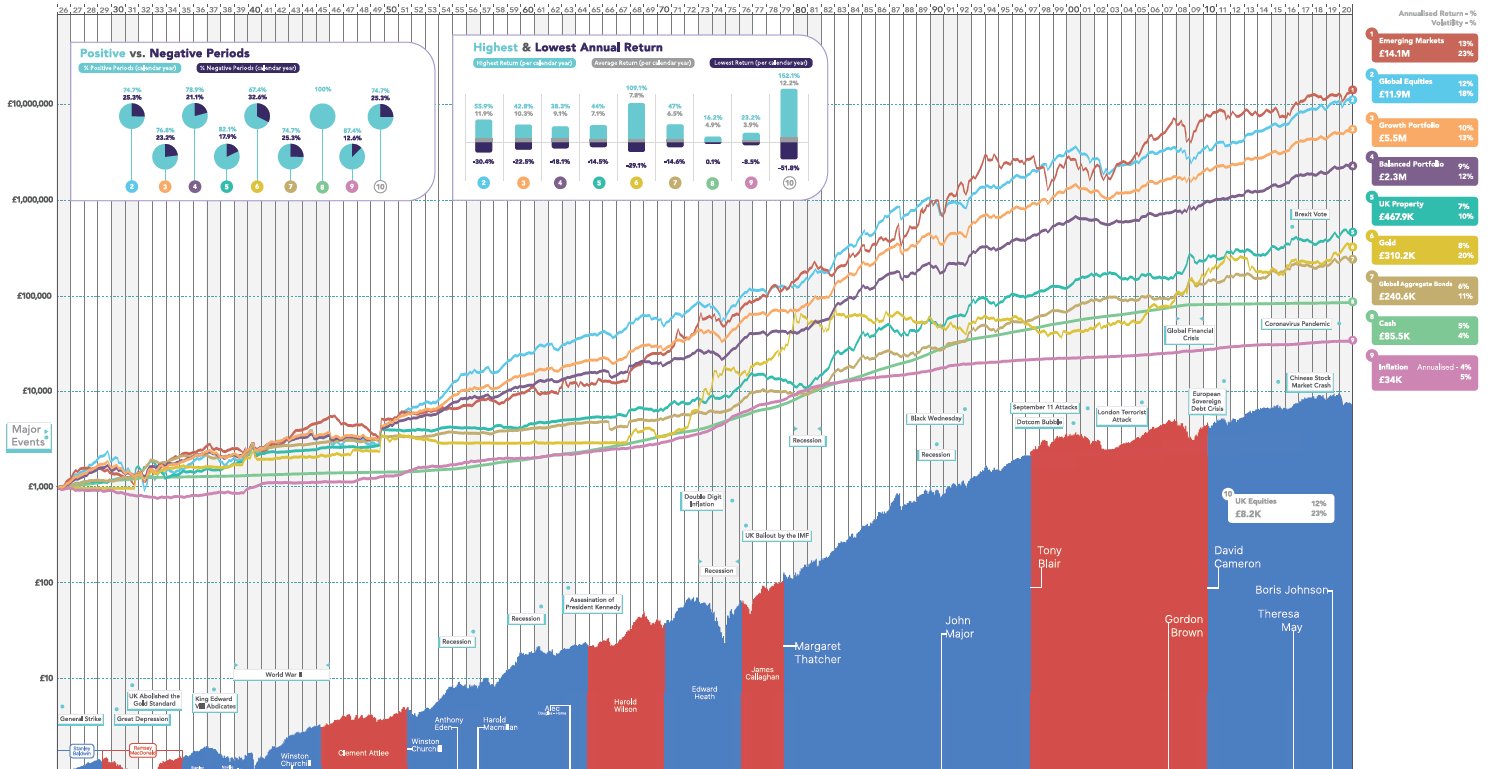
So lets look at the vehicle that the historical data would say has delivered the highest returns.
This would correspond to accelerating the date at which we can retire.
If retirement is defined as the point at which we start CHOOSING to work rather than feel obligated to… then the sooner we have this the better.
Hence the more we accelerate this the better.
The below graph is interesting because it shows the growth in value of various asset classes since the year 1926.
You can see world equities have been the asset that has spent the majority of the time at the top.
Of course there is no guarantee that this will always be the case. However we certainly want the data on our side when it comes to such decisions.
If you can take emotional factors out of your investing and have a long term timeframe this is useful to know.
Of course there are a few more factors to consider when it comes to designing a portfolio for your retirement.
But its a good place to start.
*Not Financial Advice
Disclaimer: The content on this blog is meant for informational purposes only and does not constitute financial advice. Readers should seek guidance from a professional financial advisor before making any investment decisions.


Who Is James? Who Is James? This community is for Dentists who want to accelerate their journey towards financial freedom. This means that we have freedom of CHOICE in any

What Is The Best Long Term Investment? What Is The Best Long Term Investment? Great question – and really “the best” can only be defined relative to your overall objective.For

From Dentist To Financial Coach, New E-learning Platform To Empower Professionals From Dentist To Financial Coach, New E-learning Platform To Empower Professionals In an era where financial literacy is as

Most Of Us Are On A Journey We Didn’t Sign Up For… Most Of Us Are On A Journey We Didn’t Sign Up For… We think it will lead us

A Game of Monopoly A Game of Monopoly I recently heard this analogy about investing which I thought was really cool…Analogies are pretty powerful because they compare something we currently

The Role Of Luck In Investing The Role Of Luck In Investing Here’s a really insightful piece on “Luck” and how you can create your own day to day. Particular

So What Is Inflation? So What Is Inflation? Inflation in a nutshell is a measurement for the rate at which everyday real-world prices increase over time. Its specifically a measurement